
The Big Reveal
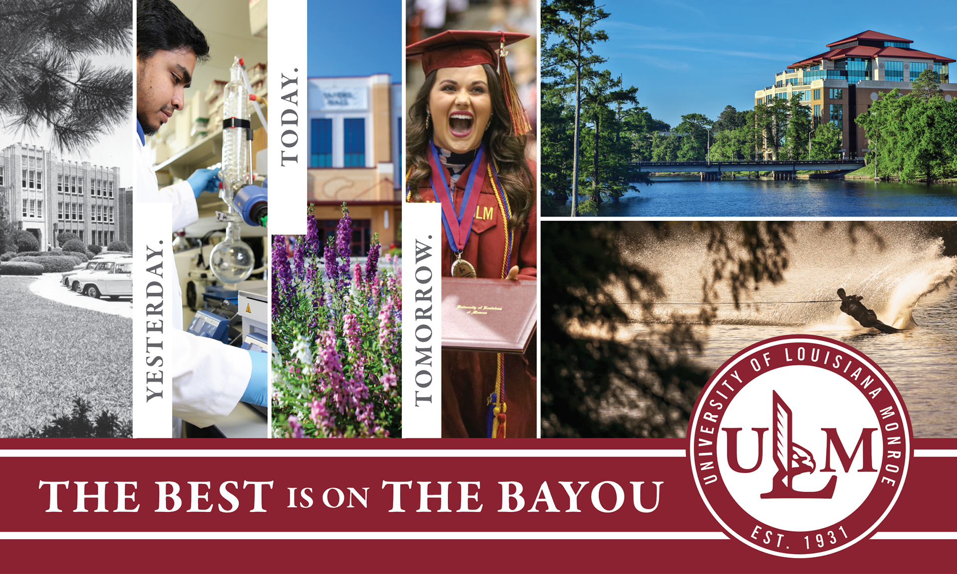
Yesterday. Today. Tomorrow.
Brand Identity Design, Summer 2017
Transforming Institutional Identity Through Cultural Discovery
ABOUT
The University of Louisiana Monroe (ULM) is a public university located in Monroe, Louisiana, with a history dating back to 1931. As part of the University of Louisiana System, ULM serves thousands of undergraduate and graduate students through programs in health sciences, business, education, pharmacy, aviation, the arts, and STEM fields. Known for its strong community ties and career-focused education, the university continues to evolve while maintaining a deep connection to its regional heritage.
BRIEF
In May 2015, I was tasked with helping the University of Louisiana Monroe restore campus pride through a new brand identity. At first glance, the assignment appeared straightforward: redesign the university's visual identity and create a stronger logo system.
However, I believed the challenge extended far beyond aesthetics. Rather than asking "What should the new logo look like?" I asked a different question:
Why had institutional pride diminished in the first place?
That question fundamentally changed the direction of the project.
DISCOVERY
Research revealed that the university's greatest challenge was not its logo, it was its identity.
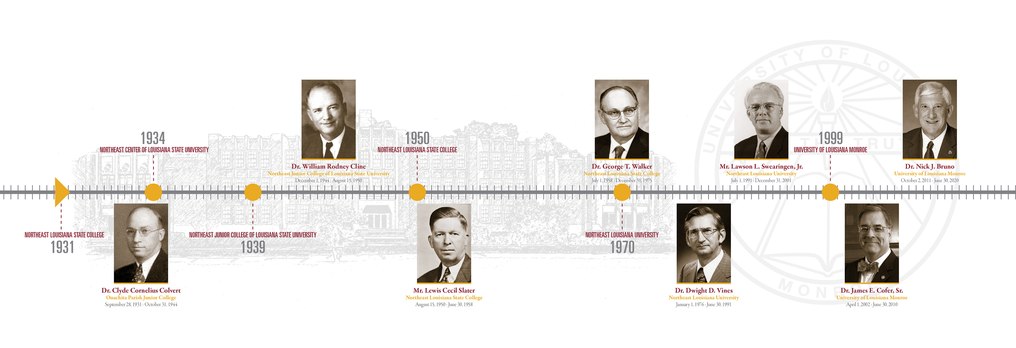
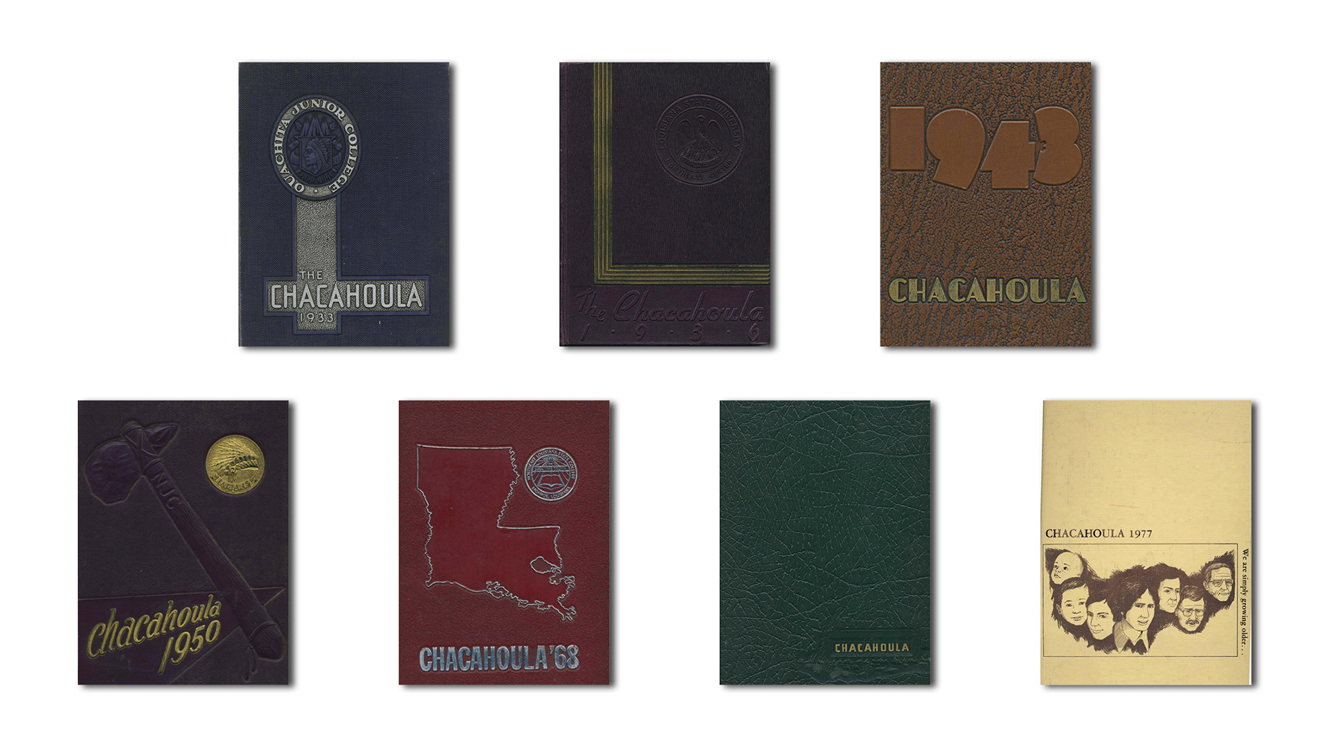
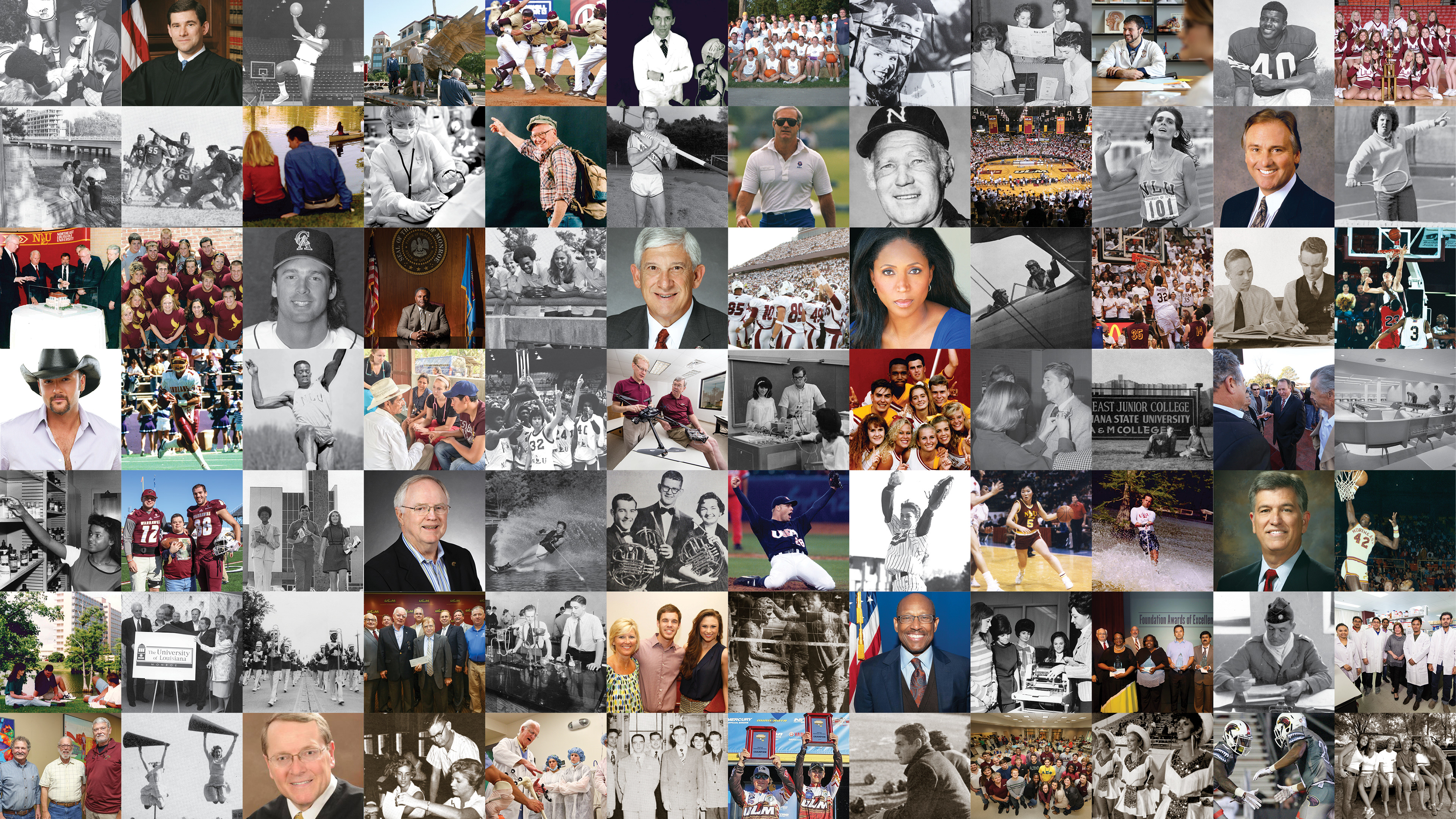
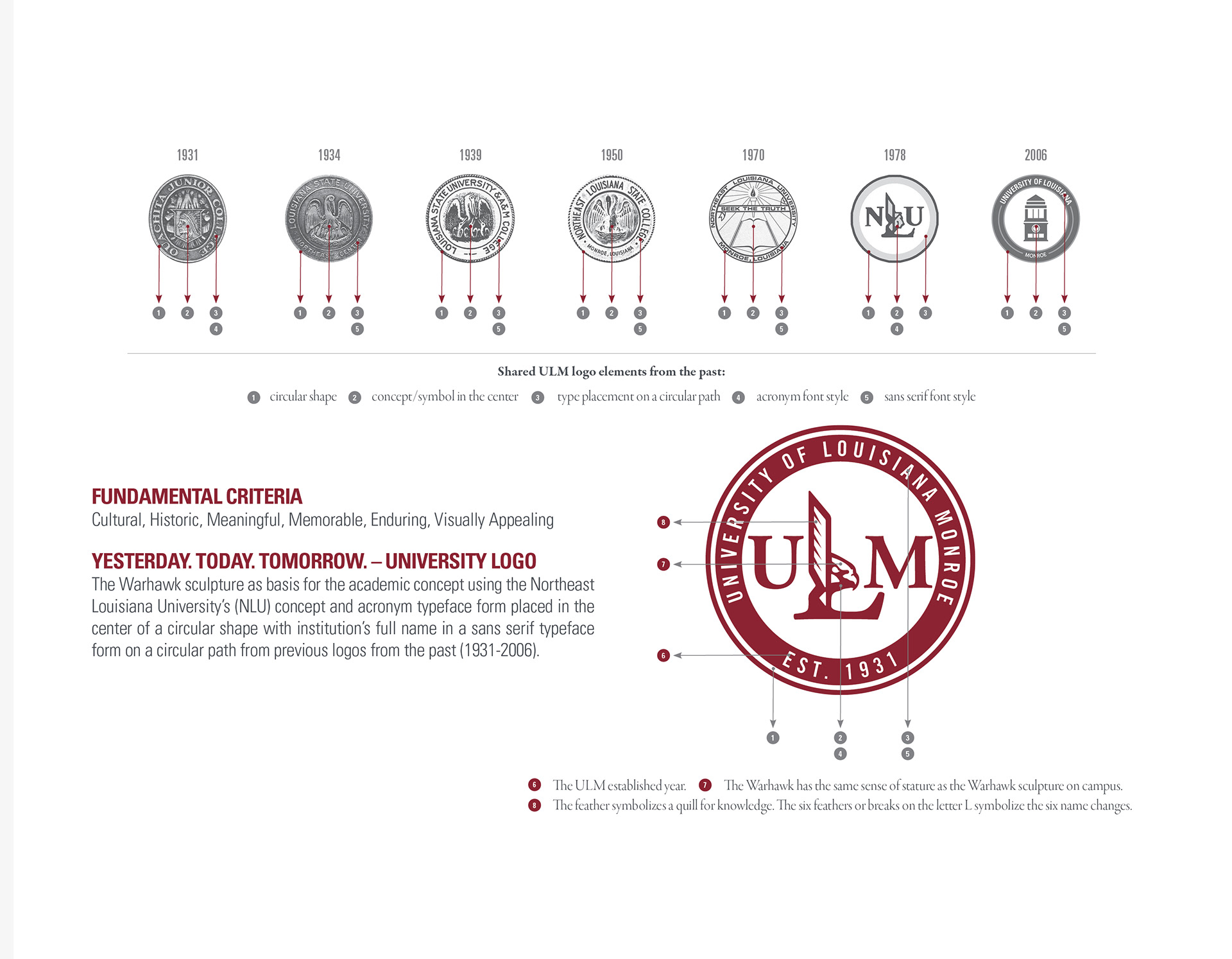
Over decades, the institution had evolved through six different names, multiple visual identities, and changing traditions. Alumni, students, faculty, staff, and community members often identified with different eras of the university, creating fragmented perceptions rather than one shared institutional story.
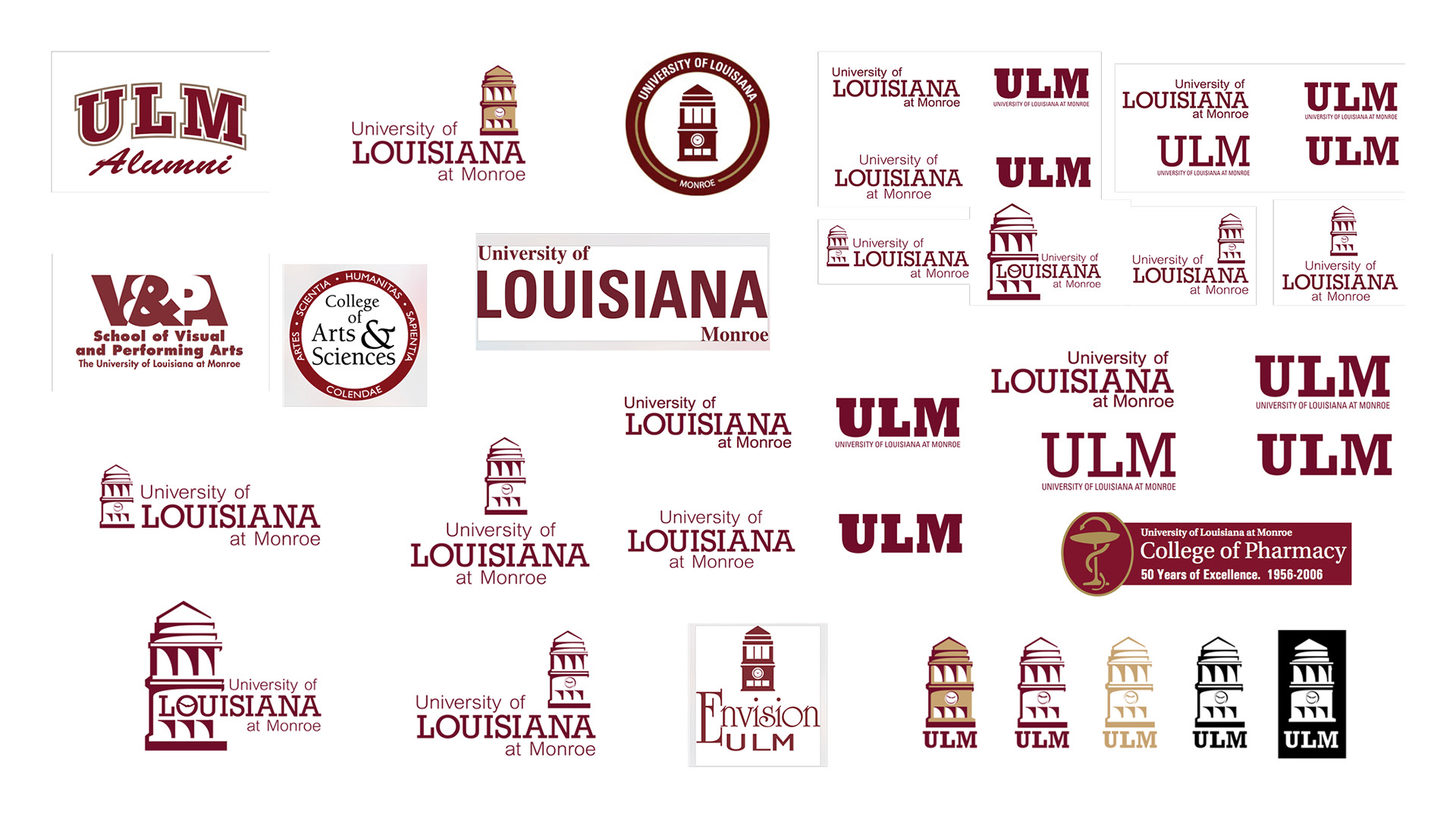
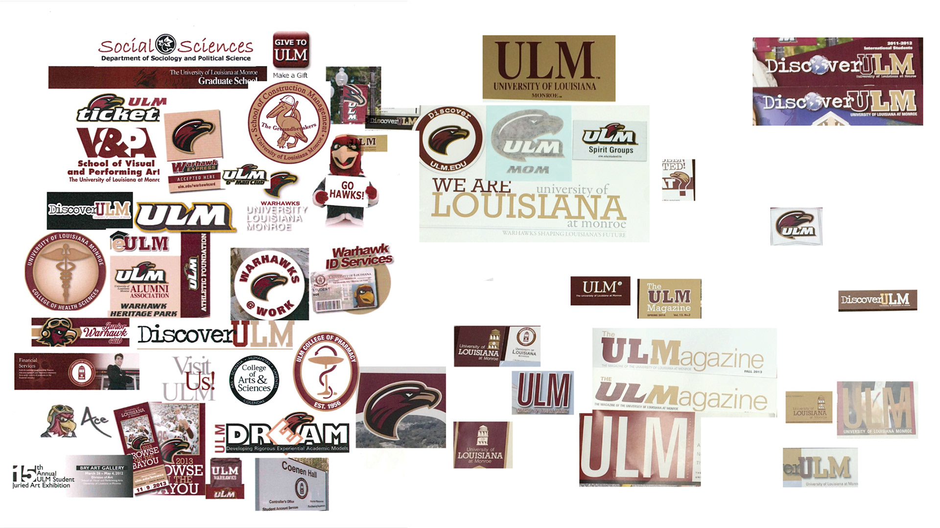
The existing identity system reflected this fragmentation. The previous library-inspired logo lacked the symbolism and emotional connection necessary to represent the university's aspirations. Multiple variations of the mark created inconsistencies across applications, while technical issues affected reproduction, scalability, and cost-effective implementation.
The deeper issue was not visual inconsistency.
It was the absence of a unifying narrative capable of connecting generations while positioning the university for the future.
The university did not lack pride.
It lacked a shared story.
STRATEGIC INSIGHT
Rather than treating the university's history as something to overcome, I saw an opportunity to embrace it. The strategy became one of transformation rather than replacement.
Instead of creating another logo, the goal was to develop an identity system that acknowledged the university's evolution, honored its heritage, and created a shared sense of belonging for current and future generations.
The identity would become more than a visual symbol.
It would become a framework for institutional storytelling.
DESIGN PHILOSOPHY
A successful identity is not defined by the shape of its logo, but by the consistency of its application and the meaning it accumulates over time. Recognition is earned through repeated experience. Trust is built through authenticity.
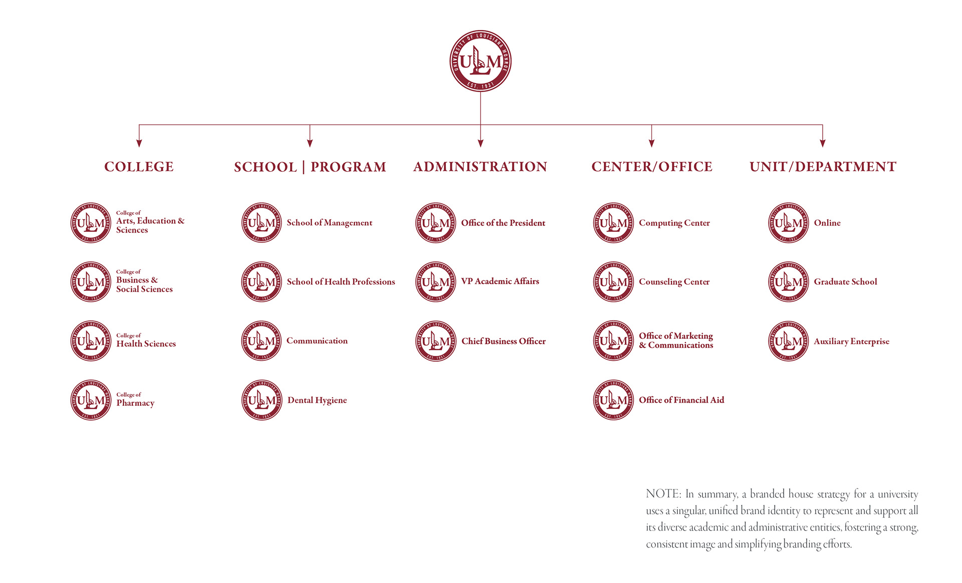
Rather than creating multiple logo variations, the objective was to establish one unmistakable identity capable of representing the university consistently across every touchpoint.
The system was guided by four enduring principles:
• Bold — Immediately recognizable and effortless to apply.
• Memorable — Distinctive enough to remain meaningful across generations.
• Versatile — Effective across every medium and application.
• Appropriate — Faithful to the university's character, mission, and academic stature.
Designed to transcend trends, the identity was created as a long-term institutional asset rather than a short-term visual refresh.
RESEARCH
The project was informed through extensive historical, cultural, and visual research that included:
• Institutional history and archival materials
• Previous university identities
• Stakeholder conversations
• Alumni perspectives
• Community perceptions
• Brand architecture analysis
• Visual identity audits
• Competitive benchmarking
• Cultural symbolism
Every discovery was evaluated through one guiding question:
How can one identity allow every generation to recognize themselves in the future of the university?
THE SOLUTION
The resulting identity unified the university's academic and athletic brands through one cohesive story. The Warhawk became more than an athletic mascot, it evolved into a symbol of vision, resilience, determination, and institutional pride.
Historical references were intentionally preserved throughout the system, allowing alumni to recognize familiar elements while presenting a contemporary identity for future generations. The identity simplified the university's lengthy name without sacrificing recognition, strengthened institutional consistency, and established a scalable brand architecture capable of supporting every university touchpoint.
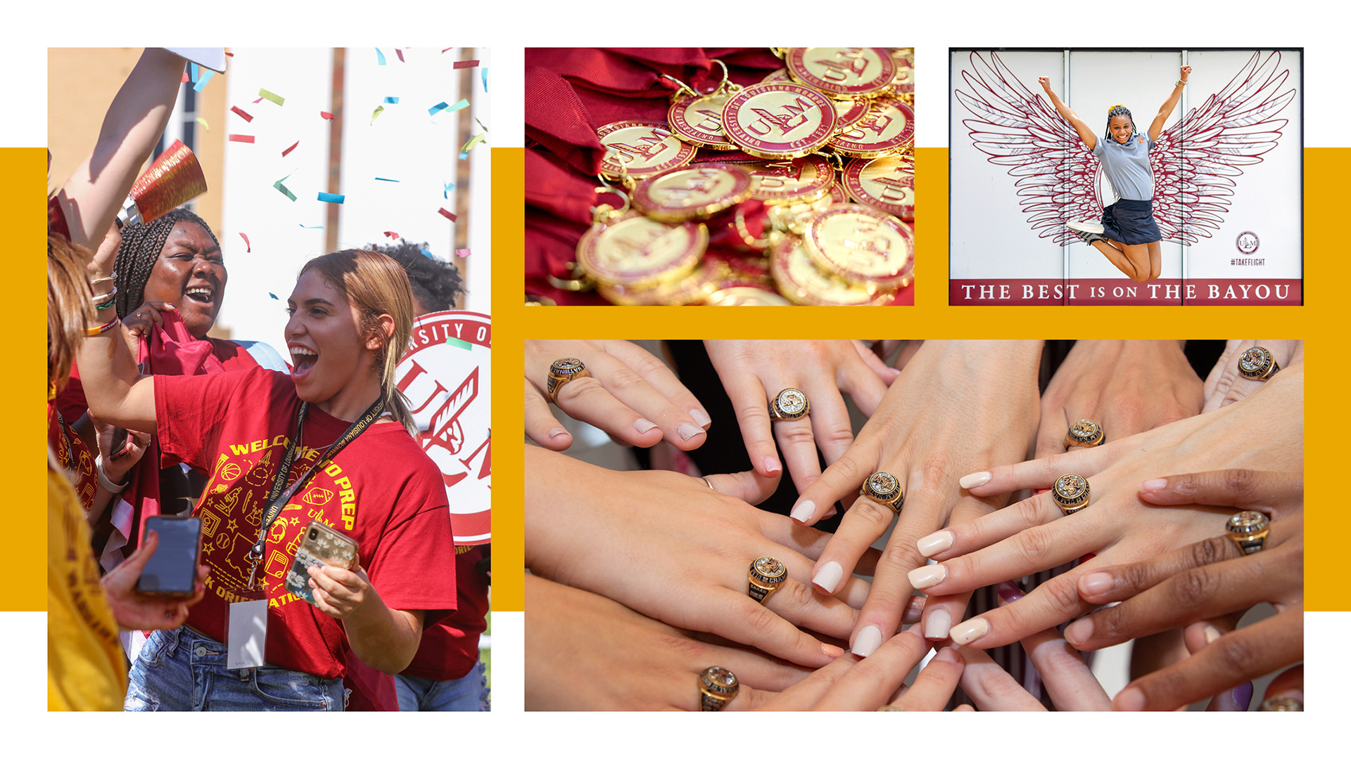
More than a logo, the project created a complete identity system designed to serve the university brand.
ORGANIZATIONAL TRANSFORMATION
The impact extended well beyond visual identity. The project became the foundation for a broader transformation in how the university approached communication.
The initiative helped establish:
• A unified institutional brand
• Enterprise-wide brand standards
• Audience-centered communication
• Stronger collaboration across academics, athletics, recruitment, alumni, advancement, and administration
• Long-term creative governance that continues guiding institutional communications today
The visual identity became the public expression of a much larger organizational transformation.
COMMUNITY RESPONSE
The greatest measure of success was not recognition of the logo itself.
It was seeing members of the university community recognize themselves within the story the identity represented.
Following The Big Reveal, Scott McDonald, a local businessman, longtime supporter, and ULM alumnus, shared his reaction with the university:
“I appreciate the time, effort, thought and care that went into re-developing this logo. I believe it is so important for all to know how much research was done to pull all these elements together. I first started tagging along with my folks on that campus in the mid-60’s as they continued their education in graduate school, so the images presented today made my eyes well up with tears.”
Jarrod Breithaupt, a ULM alumnus and staff member whose entire immediate family are ULM graduates, reflected on the proposal's ability to unite the university's past and present:
“I think the new logo perfectly ties together the old cultures of NLSC and NLU and the new culture of ULM. I believe it is all-encompassing for our identity. It pays homage to the past, embraces the present, and blazes a new trail into a bright-looking future.”
REFLECTION
Looking back, the most meaningful outcome of this project was not designing a new logo. It was discovering that the university did not have a branding problem. It had an identity problem. Once the underlying challenge became clear, the visual solution emerged naturally.
That experience fundamentally shaped my approach to creative leadership. I believe the most meaningful design work begins by uncovering the problem beneath the problem. By combining research, empathy, cross-cultural perspective, and systems thinking, design becomes more than a visual solution, it becomes a catalyst for organizational transformation.
Role: Creative Director, Brand Strategist, Lead Designer
Responsibilities: Discovery • Brand Strategy • Stakeholder Research • Creative Direction • Identity Design • Systems Design • Implementation • Brand Governance
Responsibilities: Discovery • Brand Strategy • Stakeholder Research • Creative Direction • Identity Design • Systems Design • Implementation • Brand Governance